
Breakdown of my own work
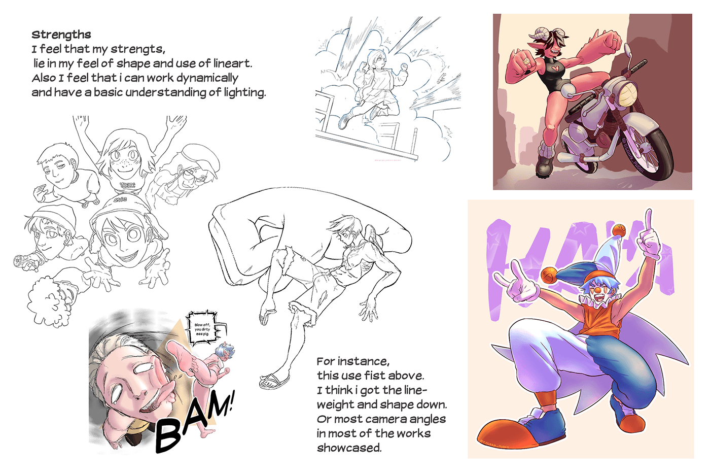
Before I begin the process of a product, I'll start out talking about the strengths, opportunities, weaknesses and threats. I try to be inspired by the artists mentioned above. The traits i talked about are also the things i try to apply in my own work.

Opportunities
Upcoming opportunities would be Illustration, Animation or Comic competitions. That could be competitions like; Fumetto international comic competition; Silent manga audition contest; Short comics competition (by Negative space); etc.
Not only competitions but i could also start a Webtoon series.
Motion comics is a medium i am also very interested in and could be a good segway into the comic social media.

Before talking about weaknesses
I tried criticizing my own work. Looking at the traits that I find noticeable. Being repetitiveness, tangents, and overall compositioning.


Conclusion
The things I feel the need to practice on are Composition and my opportunities. That being, either motion comic or card game. These would also be really nice to work in since they are subjects I am quite interested in. (Doing/making). But since I tend to be weak in drawing background illustrations, I would like to try making a slightly animated background too.
3 Inspiring artists
1. ポチャン (@poch4n)
I can summarize what this artist's work does to me, but there is a lot to take in here. There are 3 qualities that inspire me to get better in those techniques as well!
For starters, the feel for shape. What i mean by this is that you can tell by the use of shading and highlights that every artwork could work in a 3 dimensional space.
Second, The composition is unreal, there is always a certain flow in every artwork that this artists makes. some better than other works but you don't win everyday.
Lastly, Their Variety in traditional and digital work. The use of line-art in the traditional work is phenomenal. The only thing I could note is, this could make people think that it's drawn by two different artists. But nevertheless, it's amazing.


2. Tatsuki Fujimoto
This artist inspires me a lot, due to their use of lazily drawn lines per panel. But clear images that have been illustrated before your very eyes.
You can tell that the artist is well adjusted to the art style he uses for his work. And you can tell that he works fast and with confidence as every illustration is not drawn to "perfection".


3.Khyleri_
What's so amazing about this artist, is the stories that takes place in every piece of work they post. The more you look at every artwork, in detail there is always something going on.
And even though, all these characters are from other people's work of fiction. You can always tell that it's drawn by this person, which is very admirable to me.
And even though, all these characters are from other people's work of fiction. You can always tell that it's drawn by this person, which is very admirable to me.


Feedback round 1
After having a feedback round with my teacher I found new opportunities. Going more in depth on my motion concept, I could turn it into a intractable comic. Meaning it has multiple story lines and "you" the reader would be able to read the comic in your own way. Every choice has its own meaning and consequences. This way I would sort of combine my comic and card game idea. But still a little more directed to the comic concept.
Target audience
The target audience for this project, will be directed towards teenagers (around the age of 15-20) who love the concept of comics, but want to be invested in the world as if they were in it. This is possible in my concept, because the comic is intractable.
Feedback round 2
Post it notes, PowerPoint, books, block out. These are the things that i picked up from my last conversation.
As for the post it notes, these work as an adjustable block out. you write plot points or story chapters. Place them in one order and you could switch things around in mere seconds.
PowerPoint works for point and click games too! For instance, some people make those games based off of dating simulators etc. All they use is MS PowerPoint, which is free. this might be a lot of work but it could work greatly.
My teacher wants to recommend me some books that have the same concept too! so when he would lend me those i could learn more.
Moodboard
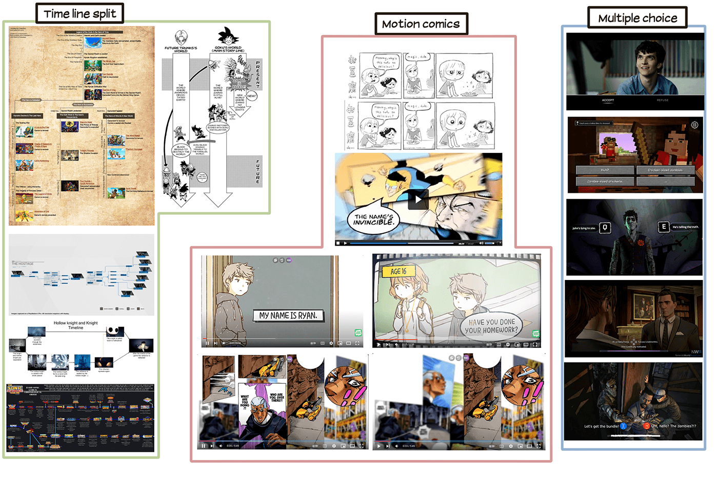
My mood board shows examples of existing Telltale games; Motion comics iterations on manga and/or comics; and timeline concepts from different games.
I want to give my self enough time to focus on pinning down the story and finishing it. But i don't want quantity over quality. That's why I leaning to a more simple but eye-catching style. Like shown in my style board.
You can tell that the shading in these examples are bare minimum, or none at all. That would make the work process way faster.

Story summary
I came up with a simple story. And starting with that, I could continue brainstorming in mind map form or post it form, as I mentioned before. The story goes as followed:
"A teenager (different planet same circumstances), grows up in the street. He has no family, but then he finds a poor dog like creature. The two start to connect and they live their lives together, until the creature get's kidnapped. What now?"
There are a bunch of things that could happen after or in between. but for that I will make an easy mind map.

I started out making silhouettes, based off of my summary and story. I had some basic ideas to begin with, since i made my mood and style board. With that I wanted to continue from that.
The hearts you see, are votes from classmates. Not knowing anything from the story they choose a design that speaks to them most. The rabbit like creature in the lower middle, was most popular.
Just before i asked for opinions, I had a talk with a teacher. Funny enough the design we liked most was a design with only one vote.

These are the 2 designs that were chosen, one by classmates. The other by my taste. I will continue to make variations per design and then I can decide which one fits the story better.


Working on the rabbit like design, I found myself struggling. I didn't want to have it look too much like an animal, since it's companion would be an small animal. Although I really like the silhouette, it would probably work with a different project.


Then I started working on the creature design for the companion. I started out with some basic rounder shapes and added what felt good. no good planning out necessarily but more feeling a character out. The designs I liked most are marked with a green circle.

I started making turnarounds of the characters and I came to a conclusion that the elongated creature would work best. As it would be most expressive, or at least easier to translate.

Next up, was working on the color schemes on the creature. For starters I didn't want to have too diverse of a color scheme as I want the color scaling of the comic to be limited. About the creature itself, I want to give off a warmer feeling and not too cold. That way you are able to really feel for the creature.


My next step was to make storyboards. So I went out and translated my timeline sheet into a visual sheet. The color of each thumbnail, is to show if it leads to a bad or good ending. The thumbnails in blue is a scene that will happen regardless which timeline you pick. And this is happens before the intractable timelines.


These are the final panels I selected and finished. but sadly due to time crunch, I wasn't able to finish the rest in time. But in the end I do have some work to show! At first I made some block out sketches.


